Arabic and English Logo Design: A Guide to Bilingual Branding
In the UAE, almost every brand speaks two languages. A customer might see your Arabic name on a storefront, your English name on Instagram, and both side by side on a business card. If those versions feel like they come from two different companies, the brand loses something every time.
Whether you need an Arabic logo for a new business or an English Arabic logo for an established brand, the goal is the same: bilingual branding that works equally well in both languages from the very beginning. It sounds simple. In practice, it's one of the most overlooked parts of branding in the region, and one of the clearest signs of a brand that was built with care.
Why bilingual branding matters in the UAE
Arabic is the official language of the UAE, and English is widely used in business and daily life. Most organizations need to communicate with both audiences, often in the same space and at the same moment.
When a brand handles both languages well, it signals respect for its audience and confidence in its place in the region. When it doesn't, the cracks are easy to spot: an Arabic logo that looks squeezed next to the English one, mismatched fonts, or awkward translations that change the meaning of a message.
Design both languages together, not one after the other
The most common mistake in Arabic and English branding is treating one language as the original and the other as a translation. Usually the English version is designed first, and the Arabic is added at the end to fit around it.
The result is almost always a compromise. Arabic and Latin scripts have very different shapes and rhythms. Arabic letters connect and change form depending on their position in a word, there are no capital letters, and the text reads right to left. A design built around Latin letterforms rarely adapts gracefully.
A genuinely bilingual brand is designed with both scripts on the table from the first sketch. Neither language is the afterthought.
Start with the name
Before any design work, decide how the brand name works in each language. There are a few options: transliterate the name so it sounds the same in Arabic, translate its meaning, or create a different name that carries the same idea. Each choice has implications.
A transliterated name keeps recognition consistent but may have no meaning in Arabic. A translated name may lose the sound of the original. Whichever route you choose, test it with native speakers to make sure it reads well and carries no unintended meaning.
How to design an Arabic and English logo
Good bilingual logo design is about balance. The Arabic and English wordmarks should feel like equals, with neither one visibly bigger, bolder, or more important unless that's a deliberate choice.
Because Arabic and Latin letters are built differently, the same point size can look very different in each script. Designers usually adjust the size, weight, and spacing of each until they feel visually matched, rather than mathematically equal.
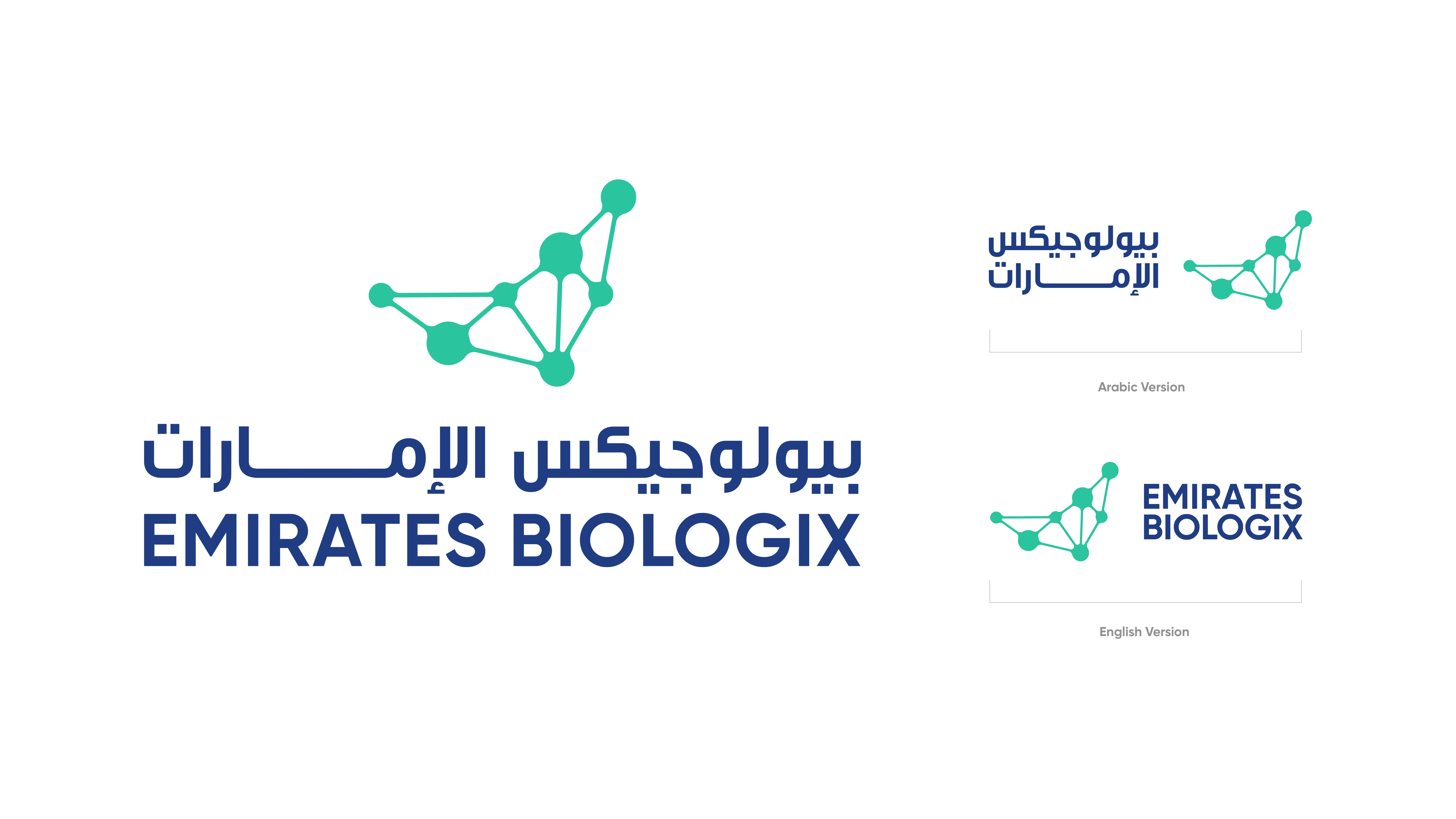
It also helps to plan a set of lockups from the start: a horizontal version, a stacked version, and versions where each language can appear on its own. Many brands also develop an Arabic logo design that stands on its own as a full expression of the brand, not just a label next to the English one.
Should your Arabic logo use calligraphy?
Arabic calligraphy is one of the richest design traditions in the world, with styles ranging from the angular Kufi to the flowing Naskh, Thuluth, and Diwani. An Arabic calligraphy logo can feel distinctive, elegant, and deeply rooted in the region.
It isn't always the right choice, though. Highly ornate scripts can be hard to read at small sizes, on screens, or from a distance on signage, and they can be difficult to pair with a clean English wordmark. Many modern brands choose a middle path: custom lettering inspired by calligraphy, or a simplified geometric style that sits comfortably next to Latin type. The right answer depends on your audience, your sector, and where the logo will appear most.
A word about free Arabic logo makers
Online Arabic logo makers are popular, and it's easy to see why. But they produce generic results that other businesses may also be using, and they can't check that letters join correctly or that the name reads well to a native speaker. A small mistake in Arabic lettering is immediately obvious to Arabic readers and can undermine trust in the brand. For a business that plans to grow, a custom design is a far safer investment.
Pairing Arabic and English typography
Typography does a lot of the work in a bilingual brand. The goal is to choose an Arabic typeface and a Latin typeface that feel like they belong to the same family, even if they come from different designers.
Look for similar character: geometric with geometric, classic with classic, and matching stroke weights and proportions. Some type families are designed with both scripts together, which makes pairing easier. Good Arabic typography also needs the right weights for headings and body text, and enough legibility for small sizes on screens and printed forms.
Layouts that work in both directions
Arabic reads right to left and English reads left to right. That affects much more than the text. Layouts, navigation, image placement, and even icons like arrows may need to be mirrored so they make sense in each language.
Decide early how bilingual materials will be laid out. Will both languages appear side by side, one above the other, or in separate versions? Will you use Western or Eastern Arabic numerals? Clear rules in the brand guidelines save countless decisions later.
Tone of voice in two languages
A direct translation rarely captures the same tone. A playful English line can sound odd in Arabic, and a formal Arabic phrase may feel stiff in English. The better approach is often transcreation: adapting the message so it feels natural in each language while keeping the same intent.
Define the brand's tone of voice in both languages, with examples, so copywriters and translators have a clear reference.
Bilingual branding on digital channels
Websites and apps add another layer. A bilingual website needs a proper right-to-left version for Arabic, not just translated text in a left-to-right layout. Menus, forms, and buttons should switch direction, and Arabic web fonts need to load quickly and render clearly. On social media, decide whether you'll post in both languages, run separate accounts, or alternate, and make sure templates are designed for both scripts.
Test it in the real world
Bilingual designs can look perfect in a presentation and fail on a phone screen or a shop sign. Test the brand on real touchpoints: small screens, signage, social posts, forms, and printed materials. Have native Arabic and English speakers review everything for both meaning and visual balance.
How D'BOX Creatives approaches bilingual branding
D'BOX Creatives is a Dubai-based branding and creative agency with capabilities across brand strategy, brand creation, brand experience, and brand activation. Since 2006, we've worked with organizations across the region from our offices in Dubai, Abu Dhabi, Riyadh, Cairo, and Montreal, and our work has been recognized at WBDS and the Kyoto Global Design Awards.
As a branding agency in Dubai, we design Arabic and English together from day one, from the name and logo to typography, layouts, and guidelines. If you're building or refreshing a bilingual brand, get in touch with our team.
Frequently Asked Questions
What is bilingual branding?
Bilingual branding is designing a brand so it works equally well in two languages, such as Arabic and English. It covers the name, logo, typography, layouts, and tone of voice, with both languages planned together from the start rather than one being translated later.
Can I use an online Arabic logo maker?
Logo makers can be useful for quick mock-ups, but they produce generic designs and can't guarantee correct letter joining or meaning. For a brand you plan to build on, a custom Arabic logo designed and checked by native speakers is much safer.
Should the Arabic and English logos be the same size?
They should look visually balanced, which is not always the same as being the same size. Arabic and Latin letters are built differently, so designers adjust size, weight, and spacing until both feel equal on the page.
How do I choose Arabic and English fonts that work together?
Look for typefaces with a similar character, proportions, and stroke weights, such as two geometric fonts or two classic serif styles. Some type families include both Arabic and Latin scripts, which makes pairing easier. Always test them together at real sizes.
Is translating my English brand into Arabic enough?
Usually not. A direct translation can change the tone or meaning of a message. Transcreation adapts the message so it feels natural in Arabic while keeping the same intent, and the visual identity should be designed with Arabic in mind from the start.